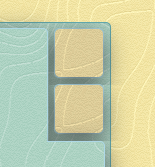

Aka why I got fed up with fiddling with the frontend part of this site. This one is not for the answers section - rather pretty much the opposite. Since It's a personal project and the other option would have been delayed shipping I let loose the standards I have for my code. This is a short description of where I wanted to go with the top-right-corner-menu design and which (bad) steps I took to bring it to life.
If you happen to know how to achieve the following with just neat and tidy html/css please do enlighten me :D.
 The first image shows how far I got with minor hacks and the second one a photoshopped version (a lie, used gimp) of what I was aiming for (with smoother shadows around the outer-corners and a round inner-corner-on-the-outside).
 If you are using a modern browser then with some luck you could also see something similar to my desired result on the top-right corner of this page (that is if you are reading this on-site and nothing has broken since I last took a look at it).
First thought - make a bloody image for the whole corner and be done with it... that is if you know how many buttons you're going to but there. I wanted to gradually add more links. So a good thing I have a repeating background and I know the height what each additional button would produce. Went with a JavaScript to match the hight of the div (below the buttons) to the rest of the content.
The goal was to make it feel like the buttons were on the same level as the main content section while casting a smooth shadow over the gaps... and not each other. Current solution uses wrapper div-s with hidden overflow on those sides where the shadows would otherwise creap over neighboring elements. As a drawback I get density differences near the cut edges of the shadow which also vary per browser.
6 words: I put an image on it.